
Whispy AI: Create Your Story
NEXBASE TECH PTE. LTD. · Entertainment · $3M/mo · 312.8K downloads · ★ 4.3
Screens9
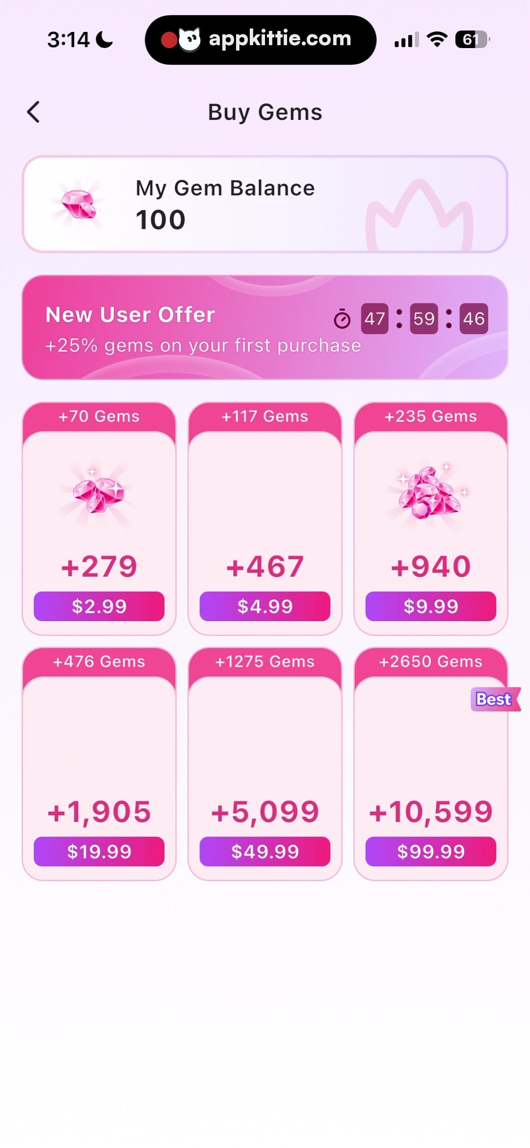
9Paywall
Colors
- #FCF3FAbackground-tint · screen background gradient top · app canvas backdrop
- #FFFFFFwhite · card background · primary button text · banner text · screen base canvas
- #E82C84vibrant-magenta · banner primary gradient · bonus badge fill · gem count label text
- #FA469Delectric-pink · banner gradient light stop · timer digit boxes · accent glow
- #9B38D8purple-accent · price button gradient base · best badge background
- #D82088deep-pink-button · price button gradient stop
- #F4B8DCcard-border-pink · gem tier card border outline
- #1A1A1Atext-primary-dark · header title 'Buy Gems' · balance text '100'
- #3A3A3Ctext-secondary-charcoal · balance label 'My Gem Balance'
Type
- screen-titleSF Pro Display · 44px · 700 · #1A1A1A
- balance-titleSF Pro Text · 38px · 600 · #3A3A3C
- balance-numberSF Pro Display · 62px · 700 · #1A1A1A
- banner-headingSF Pro Text · 40px · 700 · #FFFFFF
- banner-subheadingSF Pro Text · 32px · 400 · #FFFFFF
- timer-digitSF Pro Text · 32px · 600 · #FFFFFF
- badge-textSF Pro Text · 28px · 600 · #FFFFFF
- gem-count-labelSF Pro Display · 56px · 700 · #E82C84
- button-labelSF Pro Text · 36px · 600 · #FFFFFF
Elements
Navigation Bar · navigation_bar
Full width pinned near top below iOS status bar; contains a back chevron aligned left and 'Buy Gems' centered. · Transparent background with black navigation icons and typography.
Gem Balance Card · card
Positioned horizontally centered below navigation bar, spanning approximately 1070px width by 200px height with horizontal padding. · Soft white surface with faint pink outline, floating gem illustration on the left, balance readout centered-left, and a watermark crown shape on the right edge.
New User Offer Banner · promotional_banner
Full width minus margins (~1070px wide, ~210px high) beneath balance card, internal flex arrangement between left promotional copy and right countdown timer. · Vibrant magenta-to-pink gradient background with subtle translucent circular overlay rings and solid pink rounded countdown squares.
Countdown Timer · timer_widget
Aligned to top right of offer banner, inline stopwatch icon next to three grouped number boxes separated by colons. · Translucent dark-tinted rounded square badges hosting white monospace numerals.
Gem Purchase Card · card
Repeated in a 3-column, 2-row grid (~330px width by ~480px height each) with equal horizontal and vertical gap spacing (~40px). · White-to-light-pink subtle vertical gradient fill, 3px solid pink outline, top badge inset, optional gem icon illustration in center, large gem value text, and bottom purchase button.
Bonus Pill Badge · badge
Positioned centered along the upper interior edge of each purchase card (~220px wide by ~54px high). · Solid bright magenta background with fully pill-shaped rounded ends and white center-aligned bold text.
Price Action Button · button
Centered horizontally at the bottom inside each gem purchase card (~290px wide by ~68px high). · Horizontal gradient fill shifting from bright magenta on the right to medium purple on the left, containing white centered text.
Best Deal Badge · badge
Overlay on the top right edge of the final tier card (+2650 Gems). · Purple ribbon-style flag badge with italicized white 'Best' text and notched banner right edge.
Layout
Vertical single-column page hierarchy starting with standard iOS system elements, app navigation header, balance display card, prominent promotional timer banner, followed by a 3x2 grid of gem tier purchasing cards over a faint pink-to-white vertical gradient backdrop.
Notes
System typography resembles iOS system fonts (SF Pro Display / SF Pro Text). Font metrics and corner radii are pixel estimations based on screenshot dimensions (1170x2532). Middle card slots in row 2 lack gem icons, suggesting placeholders or simplified visual hierarchy for higher tiers.
Store


