
Storytel - Audiobooks Library
Storytel Sweden AB · Book · $1M/mo · 100K downloads · ★ 4.6
Screens10
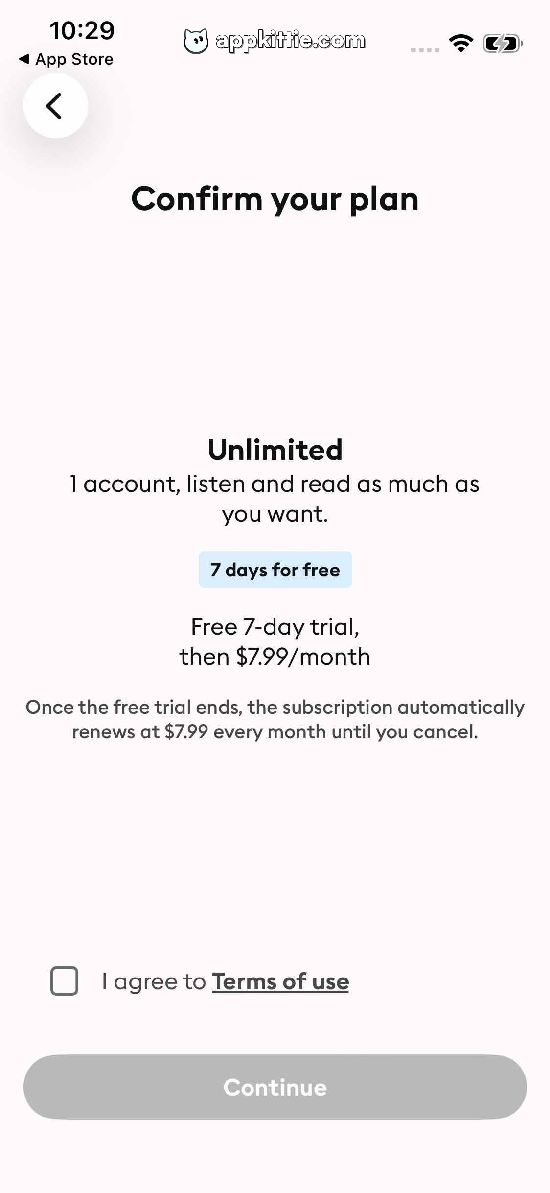
10Paywall
Colors
- #FAFAFAScreen Background · Screen background fill
- #111111Primary Text Charcoal · Screen title · Plan name headline · Trial price text · Checkbox label
- #444444Secondary Body Grey · Subtitle body · Legal/renewal disclaimer text
- #D8F0FDBadge Background Tint · Free trial badge background fill
- #0D2238Badge Text Blue-Black · Free trial badge label
- #4A4A4ACheckbox Border Grey · Unchecked checkbox border outline
- #BDBDBDDisabled CTA Fill · Disabled 'Continue' button fill
- #FFFFFFDisabled CTA Text · Disabled button text color
Type
- Screen Header TitleCircular Std · 52px · 700 · #111111
- Plan TitleCircular Std · 44px · 700 · #111111
- Plan SubtitleCircular Std · 36px · 400 · #111111
- Badge LabelCircular Std · 28px · 700 · #0D2238
- Pricing HighlightCircular Std · 36px · 500 · #111111
- Legal DisclaimerCircular Std · 30px · 400 · #444444
- Consent Checkbox LabelCircular Std · 34px · 400 · #111111
- Disabled CTA TextCircular Std · 36px · 700 · #FFFFFF
Elements
Back Navigation Button · icon_button
Top left below status bar; circle approximately 96x96 px. · White circular background with subtle soft drop shadow and centered dark chevron icon pointing left.
Trial Info Badge · badge
Horizontally centered block below plan description; approximately 280x64 px. · Solid light pastel blue fill with rounded rectangular corners, containing centered dark bold text.
Terms Checkbox · checkbox
Positioned near the bottom above the continue button, aligned horizontally with the 'I agree to Terms of use' text. · Square with rounded corners, thin dark grey stroke (~2 px), empty white interior.
Terms of Use Link · text_link
Follows 'I agree to ' text inline. · Dark bold text with an underline decoration.
Continue CTA Button · button
Spans full width with ~48 px horizontal margins; positioned at bottom edge with safe area clearance; height approximately 112 px. · Disabled state with solid muted medium-grey fill and white centered text, fully rounded pill shape.
Layout
Clean vertical plan-confirmation screen with a prominent top heading, centered tier details including trial badge and pricing terms, followed by an agreement checkbox and disabled bottom pill CTA.
Notes
Underlying font appears to match the geometric sans used throughout the app (Storytel Custom or Circular Std). Alternatives include Proxima Nova or SF Pro. Checkbox state disables the 'Continue' button until checked.
Store


