
Heyyyy: Stories that text back
heyyyyAI Inc. · Entertainment · $1.1M/mo · 184K downloads · ★ 4.7
Screens48
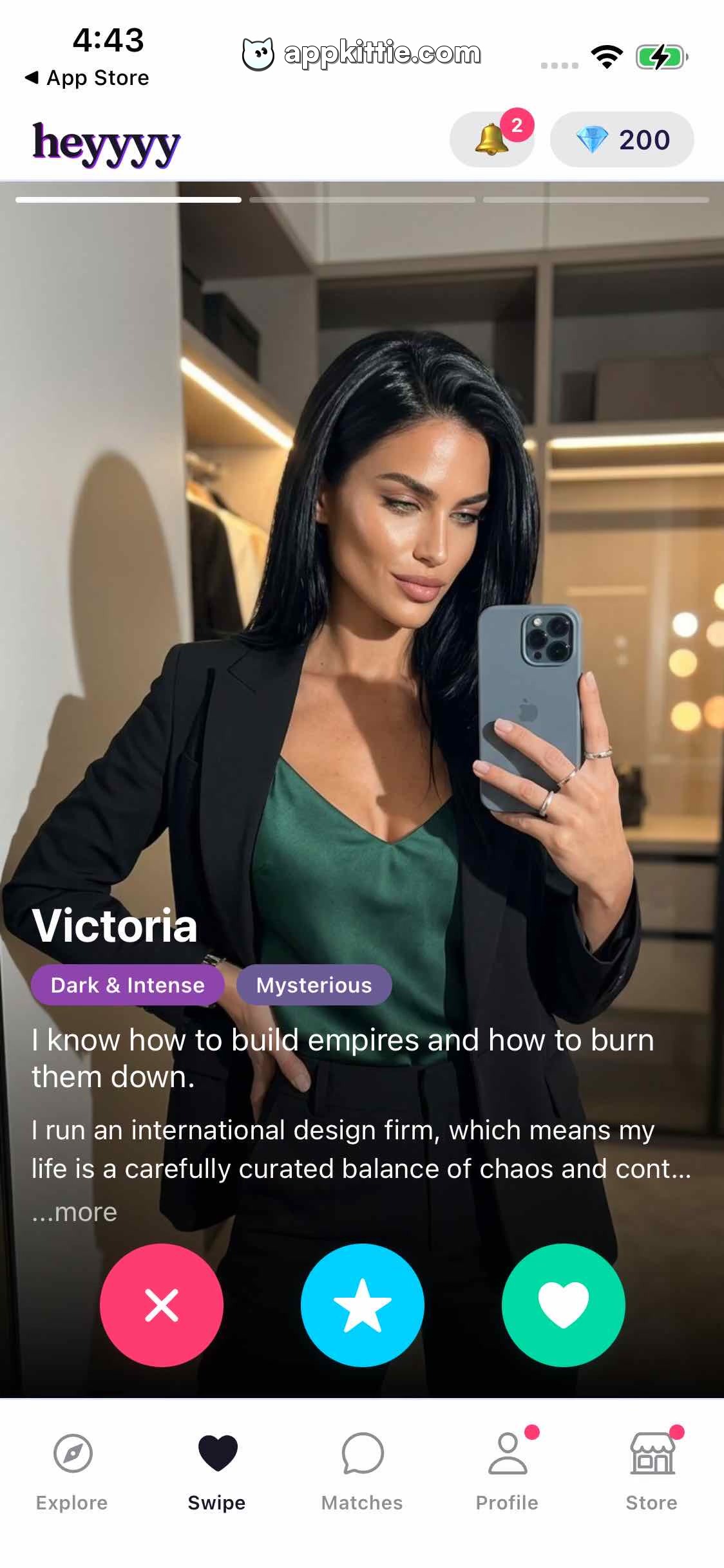
25Home
Colors
- #271253App Brand Purple · brand logo text · active navigation tint
- #FFFFFFPrimary Background · screen background · top header fill · bottom tab bar fill
- #FFFFFFPure White · profile card text · action button icons · story indicator active
- #000000Overlay Dark · scrim gradient over photo
- #FF4477Action Reject Pink · reject button background
- #00C2FFAction Superlike Cyan · superlike button background
- #00C69AAction Like Teal · like button background
- #7642A6Tag Purple · tag background for Dark & Intense
- #5D62B5Tag Violet · tag background for Mysterious
- #E83A5DBadge Red · notification counter badge background
- #8A8D9FTab Inactive Grey · inactive navigation icon and text
Type
- App Logo52px · 800 · #271253
- Profile NameSF Pro Display · 58px · 700 · #FFFFFF
- Tag LabelSF Pro Text · 28px · 600 · #FFFFFF
- Bio HeadlineSF Pro Text · 34px · 500 · #FFFFFF
- Bio BodySF Pro Text · 30px · 400 · #E5E5EA
- Tab Bar LabelSF Pro Text · 22px · 500 · #8A8D9F
Elements
Header Bar · app_bar
Fixed top bar spanning 1080px width, flex row with logo left and status indicators right · Solid white fill with no drop shadow
Currency Badge · badge
Right side of header, pill container with diamond vector icon and quantity '200' · Light pastel blue-grey fill with rounded ends
Story Segment Indicators · progress_bar
Row of 3 horizontal segmented bars positioned 24px below top of photo card · White translucent inactive segments, solid white active segment
Profile Card · card
Center container spanning full width with edge-to-edge photography · Full portrait photography with bottom dark linear gradient overlay for text contrast
Attribute Tags · tag_group
Horizontal row below name, left-aligned, containing pill tags · Solid colored translucent fills in violet and purple
Action Button Group · button_group
Centered horizontally over lower portion of card, row of 3 circular floating buttons · Circular filled buttons with drop shadows; outer buttons are 180px diameter, center is 180px
Bottom Navigation Bar · tab_bar
Fixed bottom bar spanning full screen width with 5 equidistant icon+label columns · White background with light stroke divider at top edge
Layout
Card swipe dating interface featuring a fixed upper navigation bar, full-screen vertical swipe photo card with gradient text overlay and floating circular interaction buttons, anchored by a 5-item bottom navigation tab bar.
Notes
Font styling aligns closely with iOS system font (SF Pro). Logo uses custom stylized lettering. Active tab is Swipe.
Store


