
Grok Bot
X Corp. · Productivity · $1.1M/mo · 1.3M downloads · ★ 4.9
Screens8
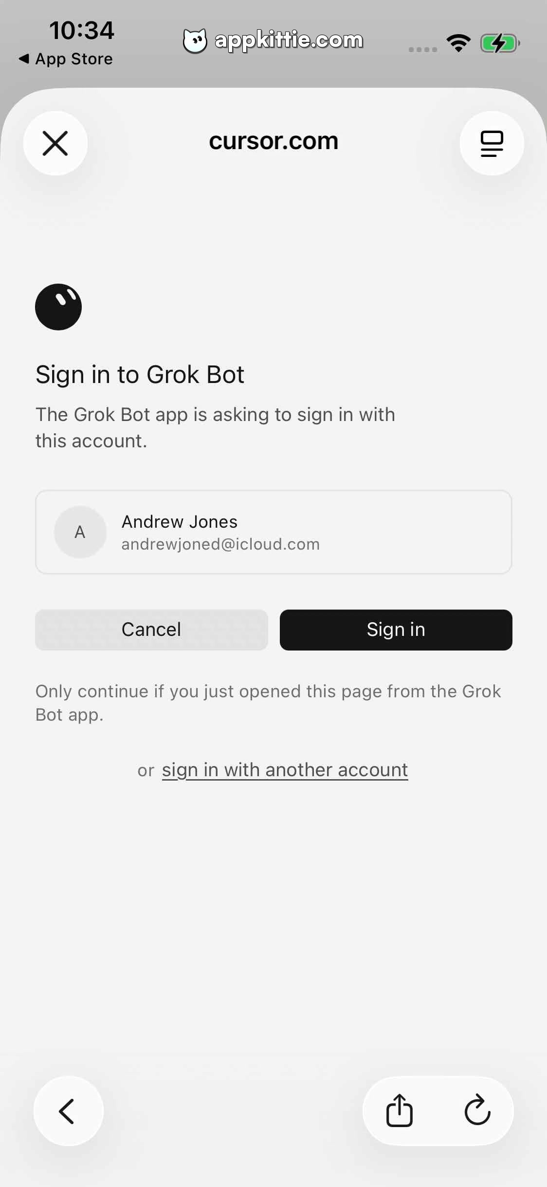
6Login
Colors
- #FFFFFFpage-bg · screen background
- #E5E5E5card-border · account card border
- #E5E5E7avatar-bg · avatar circle fill
- #EFEFEFbutton-cancel-bg · cancel action fill
- #111111button-confirm-bg · sign in action fill
- #111111text-primary · heading · user name · button text
- #666666text-secondary · instruction text · helper text · switch account link
Type
- titleSF Pro Display · 38px · 600 · #111111
- bodySF Pro Text · 26px · 400 · #444444
- buttonSF Pro Text · 26px · 600 · #111111
Elements
grok-icon · image
Left-aligned, ~70 px from left margin, ~80x80 px. · Black circle with stylized white slant marks.
account-preview-card · card
Centered block, width ~92% (~980 px), height ~140 px. · 1px border (#E5E5E5), rounded rectangle containing avatar and two lines of user details.
cancel-button · button
Left side of button pair, width ~470 px, height ~76 px. · Light gray fill (#EFEFEF) with dark text, rounded corners.
sign-in-button · button
Right side of button pair, width ~470 px, height ~76 px. · Solid black fill (#111111) with white text, rounded corners.
switch-account-link · text_link
Centered below action buttons, ~60 px margin top. · Muted gray text with underlined 'sign in with another account'.
Layout
OAuth authorization dialog layout on cursor.com, presenting app icon, description, confirmed identity row, split dual actions (Cancel / Sign in), and fallback links.
Notes
Matches desktop/mobile Cursor auth style with subtle border cards and dual-action row.
Store


