
Chatbot AI Assistant - Genie
APPNATION YAZILIM HIZMETLERI TICARET ANONIM SIRKETI · Productivity · $1M/mo · 691K downloads · ★ 4.7
Screens5
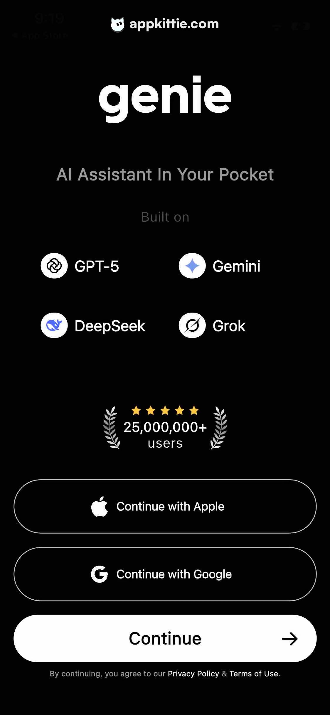
1Welcome
Colors
- #000000background-black · screen background
- #FFFFFFtext-primary-white · primary headlines · button labels · icons
- #8E8E93text-muted-gray · secondary subtitles · disclaimer body text · built-on label
- #2C2C2Eborder-outline-gray · secondary button borders · badge borders
- #F5A623rating-gold · star rating icons
Type
- brand-logoSF Pro Display · 92px · 800 · #FFFFFF
- taglineSF Pro Display · 38px · 600 · #8E8E93
- section-captionSF Pro Text · 28px · 400 · #636366
- model-badge-labelSF Pro Text · 32px · 600 · #FFFFFF
- social-proof-numberSF Pro Display · 36px · 700 · #FFFFFF
- social-proof-labelSF Pro Text · 28px · 400 · #FFFFFF
- button-primarySF Pro Text · 36px · 700 · #000000
- button-secondarySF Pro Text · 32px · 600 · #FFFFFF
- legal-footerSF Pro Text · 22px · 400 · #8E8E93
Elements
Brand Wordmark · text
Centered horizontally near the upper third of the screen, approximately 260px from the top edge. · Bold lowercase white letterforms with tight tracking.
Model Badges Grid · badge_group
2x2 centered grid below the 'Built on' label, with horizontal gap of 80px and vertical gap of 40px. · Pill-shaped containers or inline icons with circular white glyphs and bold white titles.
Laurel Social Proof Unit · graphic_badge
Centered vertically between model badges and authentication options; includes 5 stars above user count flanked by laurel branches. · Five golden yellow stars, white laurel leaf illustrations, and stacked white text.
Apple Sign-in Button · button
Full width with 60px horizontal margins, 130px height, centered horizontally above Google button. · Transparent background with 2px stroke in muted gray, white Apple logo icon on left, centered text.
Google Sign-in Button · button
Full width with 60px horizontal margins, 130px height, spaced 24px below Apple button. · Transparent background with 2px stroke in muted gray, white stylized 'G' icon on left, centered text.
Primary Continue Button · button
Full width with 60px horizontal margins, 130px height, positioned below third-party sign-in buttons. · Solid white pill container with bold black centered text and right-facing arrow icon aligned toward the right edge.
Layout
Single-column centered onboarding intro screen on a pure black background, featuring branding and capability badges in the upper half, social proof in the center, and a vertical stack of full-width action buttons at the bottom.
Notes
Typographic appearance resembles Apple system SF Pro Display/Text. System status bar elements visible at extreme top edge.
Store


