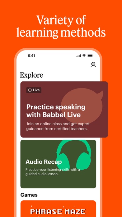
Babbel - Language Learning
Babbel GmbH · Education · $3M/mo · 201.1K downloads · ★ 4.7
Screens25
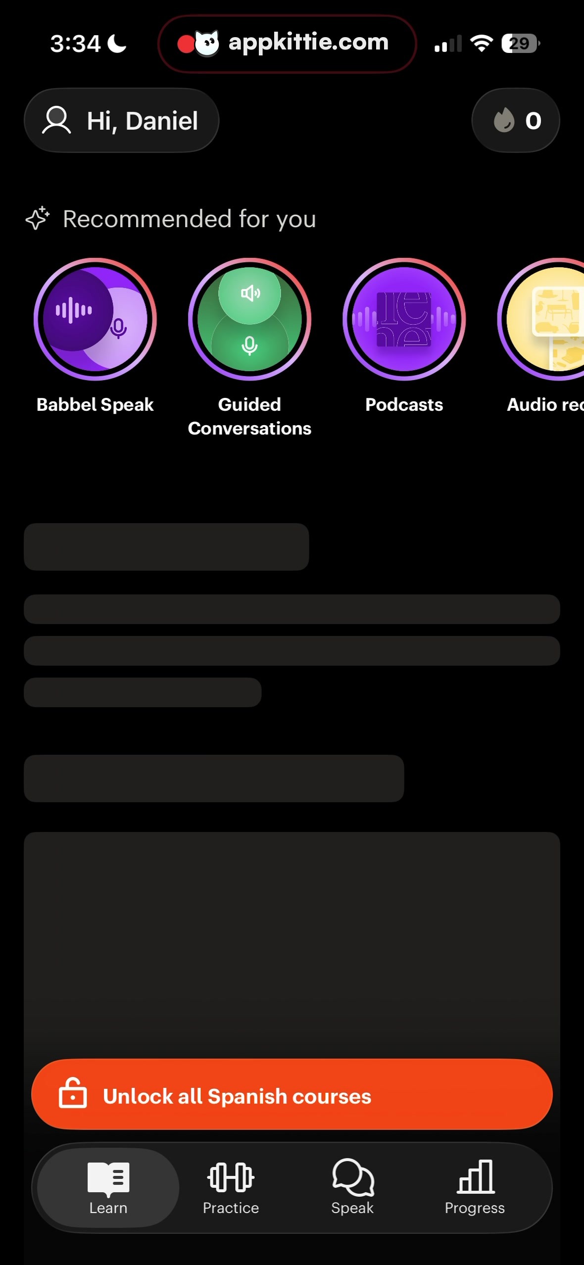
25Home
Colors
- #000000Screen Background · screen-surface
- #1D1E1ESurface Dark Gray · chip-background · card-background · tabbar-background
- #252626Skeleton Placeholder Gray · loading-skeleton-content
- #FFFFFFText Primary White · primary-label · header-text · active-tab-icon-label
- #A4A5A7Text Secondary Dim Gray · inactive-tab-icon-label · streak-icon-dim
- #FF4E21Accent Coral Orange · cta-button-fill
- #8A3FFCCircle Purple Accent · category-circle-fill · category-circle-ring
- #38B475Circle Mint Green · category-circle-fill · category-circle-ring
- #FBE697Circle Yellow Pastel · category-circle-fill · category-circle-ring
Type
- User Greeting ChipSF Pro Text · 32px · 600 · #FFFFFF
- Streak IndicatorSF Pro Text · 32px · 700 · #FFFFFF
- Section HeaderSF Pro Text · 35px · 600 · #FFFFFF
- Category Circle LabelSF Pro Text · 27px · 700 · #FFFFFF
- CTA Button LabelSF Pro Text · 34px · 700 · #FFFFFF
- Tab Bar LabelSF Pro Text · 24px · 500 · #FFFFFF
Elements
User Profile Pill · pill_chip
Top-left below status bar, padding ~14px 28px, flex row with outline icon and text · Dark gray solid fill (#1D1E1E), white iconography and text, no border
Streak Counter Pill · pill_chip
Top-right aligned horizontally with profile pill, padding ~14px 28px, flame icon plus count · Dark gray solid fill (#1D1E1E), dim gray flame icon, white numeric counter
Recommended Header · section_heading
Horizontal row with four-point sparkle icon preceding 'Recommended for you', left margin ~45px, top margin ~40px below header pills · Inline sparkle outline icon and clean sans-serif text in white
Recommended Features Carousel · horizontal_scroll_list
Horizontal row of circular feature icons with labels underneath, scrollable horizontally with slight truncation on the right · Outer concentric ring border with gradient or dual-tone colored circles containing relevant vector icons, followed by bold white labels
Content Loading Skeleton Cards · skeleton_placeholder
Middle area consisting of rounded horizontal bars mimicking a title line, multi-line body paragraphs, and lower rectangular containers · Dark charcoal-gray skeleton bars (#252626) on deep black surface
Card Skeleton Container · card_container
Large rounded container filling the lower third of the screen above bottom navigation, width ~960px · Dark gray fill (#141516), containing the orange CTA at its bottom edge
Unlock Courses CTA Button · action_button
Positioned inside the bottom card container, horizontal span ~890px, height ~116px, centered lock icon + text · Vibrant coral/orange fill (#FF4E21), white lock icon and white bold text
Bottom Navigation Bar · tab_bar
Pinned to bottom of the screen above home indicator, full width, height ~145px, containing 4 equal-width tab items · Dark background (#121314) with subtle rounded active indicator pill behind 'Learn' tab (#333537), white active icons and gray inactive icons (#A4A5A7)
Layout
Single-screen vertical mobile layout with fixed status area, fixed bottom navigation bar, and scrolling body content containing horizontally scrolling feature circles, loading skeleton blocks, and a sticky or positioned promotional module.
Notes
SF Pro Text is hypothesized given the iOS interface chrome and metrics, but Roboto or a custom brand sans-serif (such as Babbel's custom typeface) are plausible alternatives. Content in the middle is in a skeleton loading state with mock placeholder lines.
Store